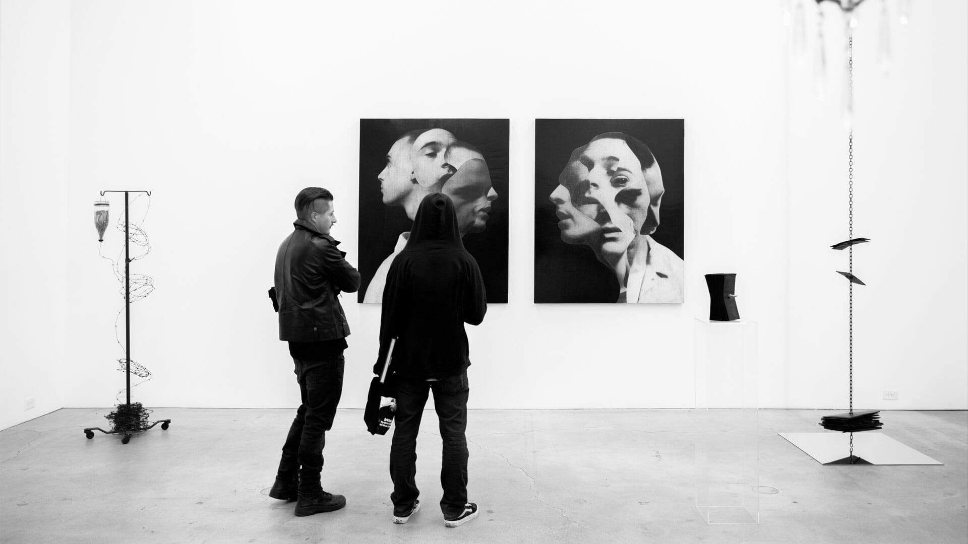
Visual Capital: Designing for the Feed, Aesthetics, Algorithms, and the Creation of Works Made to Be Seen
Visual Value as the Dominant Currency
An image is no longer simply looked at, it’s evaluated. In a split second, the eye decides whether to linger or scroll past. Artworks are no longer contemplative objects; they are visual interfaces designed to strike, assert themselves, and embed into the flow. Their value no longer lies solely in conceptual depth, research, or technique, but in their ability to exist instantly, to attract within a saturated field of stimuli, to stand out in the most competitive, algorithmic sense of visibility.
This is the context in which a new currency of contemporary art has emerged: visual impact. Ephemeral, yet immensely powerful, it shapes careers, collections, and institutional visibility. It’s not just about what the work says, it’s about how it looks. Whether it’s legible at thumbnail size, whether it has a clear visual anchor, whether it “pops” from the feed, that endless wall of images scrolling at industrial speed. Success is no longer measured by the gaze that lingers, but by the one that doesn’t flee.
The timeframe of art has contracted. It’s no longer measured in minutes of viewing, but in seconds of attention. The perceptual threshold has lowered, and with it, so has the barrier to access. An effective artwork needs no explanation, poses no questions, hides nothing. It presents itself, directly. It must seduce in the first second, because the second one might never come.
This shift isn’t just about taste. It’s systemic. It’s the result of a visual ecosystem shaped by platforms built to keep us scrolling, to never let us stop. In this environment, art survives only if it adapts to the rules of the game: visibility, immediacy, recognizability. The feed isn’t an extension of the gallery, it’s an arena. And every image is a competition for the next glance.
In the past, a work could ask for time, invite the viewer to step closer, reflect, even hesitate. Today, that same work risks disappearing, not because it lacks value, but because it lacks speed. Because it didn’t show itself fast enough, or well enough. Because it lost, not the aesthetic battle, but the algorithmic one.
In the perpetual present of the feed, art doesn’t just need to exist,
it needs to perform.
Ingredients of Visual Effectiveness
Creating an artwork is no longer enough. Today, it must be designed to perform. But what does it mean, exactly, for something to “perform” in the digital visual sphere? What formal, compositional, and aesthetic elements determine whether a piece will stand out in the flow? Under algorithmic pressure, contemporary aesthetics have developed an implicit grammar, a recurring set of visual ingredients that, even if unspoken, guide the creation of much of today’s art.
The first is symmetry. Few things grab attention faster than a balanced, centered, and visually harmonious form. The digital eye seeks order, geometry, immediate focal points. A composition that’s too complex, scattered, or asymmetrical risks disappearing into the feed. Symmetry has become more than an aesthetic choice, it’s a strategy for recognition. A symmetrical work reads better in the square format of a feed, in thumbnails, in previews. It’s legible from a distance, identifiable even at a glance.
Next comes color saturation. Vibrant, sharp, high-contrast hues, in a word: scroll-stopping. A visually effective artwork is often one that glows, that explodes in the RGB spectrum, that visually disrupts the neutral white background of the interface. Contrast is key: between light and dark, figure and ground, fullness and emptiness. Anything that isolates and amplifies a visual focal point increases the chance of catching attention. It’s the logic of the billboard, applied to art: you have to be seen, even when no one is looking.
But it’s not just about color and form. Recognizability also plays a crucial role. Effective artworks carry an instantly decodable visual identity, a pattern, a mark, a stylistic cue that allows someone to say “that’s by that artist” before even reading the name. In a feed where hundreds of images are swiped past each day, visual branding isn’t a signature, it’s a condition for existence. If you’re not recognizable, you’re forgettable.
This pressure toward simplification, toward visual efficiency, has led many artists to reverse the creative process. They no longer begin with the idea, but with the potential impact of the image. The artwork is conceived as a frame, a shot that must function well when photographed, isolated, and shared. Its success isn’t measured by its internal meaning, but by its external performance. And that world of performance is ruled by formats.
Vertical for Instagram Stories. Square for the feed. 16:9 for TikTok and Reels. The artwork must adapt, bend, transform, to fit a grid that is not artistic, but engineered. Flexibility of content now outweighs depth. Photogenic appeal replaces presence. Effectiveness becomes essence.
And all of this leads to an unavoidable question:
How much of what we call an “artwork” today is really just an interface?
And if the answer is “a lot”
are we ready to accept it?
Algorithms as the New Invisible Curators
Exhibitions are curated, but algorithms select. And often, they do it better, or at least faster, than human curators. In a visual system governed by predictive formulas, the algorithm has become the primary curatorial filter: silent, impersonal, and only seemingly impartial. It doesn’t assess the historical or critical value of a work, it evaluates its potential to generate interaction. It doesn’t read artist statements or listen to intentions; it calculates the likelihood that an image will be viewed, saved, forwarded.
(The act of viewing, as we’ll return to throughout this text, lies at the core of our argument.)
This shift didn’t happen overnight. It crept in, by habit, by design. Every time an artist uploads a work online, it’s no longer just for documentation. It’s a submission, not to a museum director, but to a neural network deciding whether that image deserves digital exposure. The feed becomes a permanent exhibition space, curated by an AI trained on collective behavior. We no longer ask what do I want to see? but what are others already looking at? Visibility becomes a self-fulfilling prophecy.
In this context, the algorithm becomes a full-fledged invisible curator. It doesn’t write wall texts, sign press releases, or deliver keynote lectures, but it decides which works reach the public. It constructs unspoken thematic narratives, pairs artists based on visual similarity, enforces trends through repetition alone. The criterion is simple: what performs, survives. What doesn’t generate clicks, disappears. There’s no room for latency, for slowness, for difficult work. Everything must perform.
This logic has a direct impact on artistic production. If it’s known that the algorithm favors certain colors, formats, or symmetries, the artist ends up adjusting their practice to match an artificial sensibility. Not out of belief, but out of necessity. To emerge. To stay relevant. For many independent artists, the feed is their only space for visibility. Ignoring its rules means choosing invisibility. In this system, the artwork becomes not just expression, but strategy.
But who, today, decides what’s worth seeing? A software. Trained on human behavior, but devoid of human intention. Works aren’t selected for their quality, but for their predictability. They’re liked because they resemble what’s already been liked. They perform because they recall something that has already performed. Art becomes an optimized echo of the already-seen, a spiral of visual self-reference feeding itself in endless loops.
And what about the human curator? They adapt, resist, or get pushed to the margins. Some embrace the new tools, others are overwhelmed by them, but no one can ignore them. Today, no exhibition exists without considering its digital extension. No artwork is conceived without some awareness of its algorithmic destiny.
The feed is the new white cube.
And the algorithm, its supreme spectator.
From Production to Pre-Production
There was a time when the artwork was born in the studio and only later documented. The creative process unfolded in an internal, autonomous, often invisible timeframe, culminating in an exhibition, a narrative, a moment of dialogue. Today, that sequence has been reversed. Art is no longer made to be exhibited, it is made to be visualized. Pre-production, the phase in which the artist imagines how the work will appear in the feed, which photo will announce it, what kind of visual impact it will have , is no longer just part of the process; it is often its driving force.
Before even beginning, the artist now faces questions once reserved for a marketing department:
How will this piece look on Instagram? What detail should be highlighted? Will it work better in color or black and white? Will it read well on a phone screen? Will it fit the vertical format of Stories or the square frame of the feed?
The logic is no longer strictly formal or conceptual, but digitally strategic.
The artwork is thus built as a premediated visual event, a structure designed to generate images even before it generates experience. It becomes a device where physical presence takes a backseat to circulation potential. The photograph of the work, once taken afterward for archives or publications, is now often the real final product, the image that will live on, be shared, be remembered.
Even the creative process itself is reshaped by this logic. Studio moments become content. Sketches, experiments, and unfinished phases are no longer hidden, but repurposed as material for anticipation. The “work in progress” narrative is carefully orchestrated, not to document, but to build hype, to generate previews, to feed the algorithm. The temporality of the work fractures into micro-content, each fragment crafted to exist independently within the timeline.
In this dynamic, the physical exhibition loses its centrality. It’s no longer the core of the experience but the endpoint of something that has already played out elsewhere. The audience arrives preloaded, with images, expectations, screenshots. The encounter with the real work becomes a form of verification: Does it match the photo? Is it “better” or “worse” in person? Direct experience is secondary to its prefiguration.
This inversion of time, this aesthetic of anticipation, makes art production resemble a launch campaign. The artist acts like a content director, a trailer-maker. The work must generate hype, produce images before it’s even finished. And in this scenario, the risk is clear: that the form of the artwork is not dictated by internal necessity, but by its ability to perform before it exists.
The question that emerges, quiet but insistent, is this:
Are we still creating artworks, or just building visual promises?
(And promise is, quite literally, the word at the heart of it all.)
The Schools of Engagement
In an art landscape dominated by the logic of the feed, even style becomes strategy. What emerges are true aesthetic schools of engagement, recurring visual languages not built around movements or manifestos, but around their ability to generate attention. There are no theoretical programs, no critical positions, only tested, repeated, selected visual patterns. The artwork no longer arises in opposition to a dominant aesthetic; it is born within it, attuned to the invisible rules of visibility.
The first of these schools is that of coherent seriality. The feed rewards consistency: a sequence of recognizable works, with a stable color palette and a uniform visual rhythm. The artist becomes the curator of their own profile, constructing a visual narrative that doesn’t tolerate disruption. Any sharp deviation, any formal detour, risks breaking the flow, confusing the algorithm, or “disorienting the audience.” As a result, experimentation is minimized. The work becomes a variation on a theme, a repeated difference, but never a real surprise.
Another approach is instant iconicity. Here, the goal isn’t to build a visual journey, but to create a strong, isolatable image, perfect for extraction and sharing. It’s the art of the single visual strike: a symbol, a bold gesture, a central figure. The work functions like a logo, instantly recognizable, easily memorable, shareable without context. It’s an aesthetic of immediacy, where ambiguity, nuance, and layering become barriers to engagement.
Then there’s the glitch aesthetic, the controlled defect: pixelation, digital errors, visual distortion. But this, too, has paradoxically become predictable. Glitch is no longer a rupture in the system, but one of its accepted variations. It’s a codified, recognizable aesthetic, often used to stand out within the very system it pretends to critique. Visual noise becomes a stylistic signature. The error, a strategy.
Finally, there’s referential irony, where art and meme culture intersect. An aesthetic that works by playing with the codes of internet culture: remixed images, retro fonts, web-sourced frames, pop references. In this universe, the artwork isn’t original, but relational, it exists only in dialogue with a familiar visual world, something the viewer can recognize and re-activate. It’s art designed not for contemplative isolation, but for viral inclusion.
These schools, and there are many more, are not organized or labeled, but they’re everywhere. They’re models of visual success, more than artistic positions. And anyone who wants to take part in the contemporary visual conversation must, in one way or another, engage with them, even if only to reject them.
The result is a hyper-specialized visual ecosystem, where every artwork is a potential answer to the algorithm.
And in this ecosystem, only one rule applies:
Nothing can afford to be silent, ambiguous, or invisible.
Everything must function.
Everything must emerge.
Even at the cost of losing its complexity.
The Aesthetics of Recognizability vs. the Aesthetics of Complexity
In an era where visibility is everything, recognizability has become a form of survival. It’s no longer enough to create a powerful work, one must also create an instantly identifiable language, a visual mark that allows the viewer , or rather, the user, to associate an image with a name, a style, a brand. The work must declare its origin; it must be “by” someone. If it isn’t recognizable, it’s irrelevant. If it isn’t clear, it’s forgettable.
As a result, many artists develop a repeatable personal grammar, a visual syntax that can be endlessly deployed without losing impact. We talk about “visual identity” and “stylistic consistency,” but what’s really being sought is algorithmic loyalty: an aesthetic that works every time, that doesn’t deviate too much, that’s reliable. It’s a form of aesthetic branding, a trademark, like a signature legible from afar.
But this drive toward recognizability comes with a clear side effect: simplification. Complex, ambiguous, layered works, the ones that require time, that reveal themselves slowly, struggle to survive in the logic of the feed. They’re too demanding. They don’t explain themselves. They don’t offer a return within a second. And so, more often than not, they’re skipped.
By contrast, the recognizable artwork wins because it is readable. It doesn’t ask for interpretation, it offers confirmation. It’s the visual equivalent of a musical hook: a familiar sequence that feels good precisely because it’s already known. It doesn’t invite doubt, it reassures. It doesn’t open, it closes.
Yet in that clarity lies a paradox:
The more recognizable a work is, the less it needs to be truly seen.
Knowing what it looks like is enough to justify scrolling past.
This logic places pressure not only on artists, but also on curators, galleries, and critics. Everything begins to revolve around the repetition of the mark, the power of the logo, the linearity of the message. Critical thinking, which by nature thrives on ambiguity, finds less room to breathe. Complexity is perceived as noise. Doubt becomes a disruption in the flow.
But what do we lose in this transformation?
We lose the possibility of the unexpected.
We lose the artwork that forces us to pause, to look longer, to reconsider.
We lose, perhaps , art as a transformative experience, rather than just effective content. Because if everything we see only serves to confirm what we already know, then the space for the new begins to shrink. And with it, the space for complexity.
In a system where every image must be instantly recognizable, the artwork that refuses to “perform” might be the only one that truly matters.
But how many of those works are we still able, or willing, to see?
What If the Artwork Is Too Perfect to Work?
An artwork that functions too well stops asking questions. It’s so finely tuned, so optimized, so harmonized with the digital context that its effectiveness becomes predictable. It’s beautiful, but it doesn’t unsettle. It’s visually seductive , but leaves no residue. It invites the gaze, but demands no understanding. In a world dominated by visual performativity, perfection risks becoming an aesthetic trap, an end point that coincides with the abandonment of depth.
The paradox is clear:
The more an artwork is designed to “perform,” the more it risks neutralizing its own expressive urgency.
It’s the logic of hyper-visual awareness: every element is controlled, every asymmetry intentional, every imperfection calculated. There’s no room for error, for instinct, for deviation. Everything has already been anticipated, packaged, filtered, for an audience that no longer has time to look, only time to react.
And yet, art history is full of uncomfortable works, moments that disturbed the eye before entering the collective imagination. Think of Fontana’s slashes, Tillmans’ blurry photographs, Mike Kelley’s deliberately chaotic installations: works that didn’t “perform” in algorithmic terms but instead opened gaps, generated fractures. Today, many of these practices would be seen as anti-performative. Not Instagram-friendly. Aesthetically opaque.
Visual perfection becomes a form of systemic adaptation.
A perfect work is one that has already learned how to be seen, how to be saved, how to be remembered. But in doing so, it risks becoming a sealed surface, a glossy skin without organs. It doesn’t live; it functions. It doesn’t surprise; it confirms. It answers the wrong questions:
“Does it fit the feed?”
“Does it catch the eye?”
“Does it generate engagement?”
Within this landscape, imperfection regains value, not as a strategy, but as an honest gesture, unmediated. The unfinished work, the unsettling detail, the unresolved composition, anything that escapes the logic of effectiveness becomes an act of resistance. Not a rejection of visibility, but an invitation to see differently. To slow down. To not understand immediately.
Perhaps this is where art can still survive:
in what doesn’t perform,
in what fails by the system’s standards,
but touches something elsewhere.
Because if everything works, then nothing resonates.
If everything is already optimized, there’s nothing left to discover.
And maybe, then, the role of the artwork isn’t to “function”
but to interrupt.
Not to adapt, but to misalign.
Not to confirm the grammar of attention, but to rewrite it from scratch.
fakewhale
Founded in 2021, Fakewhale advocates the digital art market's evolution. Viewing NFT technology as a container for art, and leveraging the expansive scope of digital culture, Fakewhale strives to shape a new ecosystem in which art and technology become the starting point, rather than the final destination.
You may also like
Fakewhale in dialogue with James Bloom
In his latest project, Half Cheetah, James Bloom tackles a theme that is as technical as it is exist
Post Internet Subcultures through the Art of Jesse Draxler
Subcultures were once esoteric, known only to the initiated, and difficult to gain access to for out
24 Hours of Art with Roger Dickerman
In August 2023, Roger Dickerman, Founder of Artifex, art curator and advisor, set out on an ambitiou


